The problem
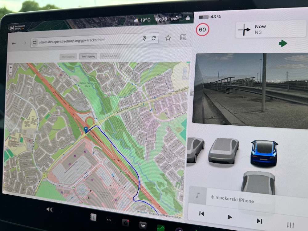
I’ve been creating and serving web-based maps such as this one for some time. That’s based on raster tiles, and an osm2pgsql database is used to store the data that the tiles are created from, on demand as a request to view a tile is made.
For various reasons I wanted to also create a similar map using vector tiles. With vector tiles what is sent to the client (such as a web browser) is not lots of small pictures that the client stitches together, but instead larger chunks of data, still geographically separated. The client then creates the map itself based on the style that it has been told to show the data in, combined with the data itself.
I’d noticed that the vector maps that I was displaying were sometimes slow to load, especially at some lower zoom levels such as vector zoom 8. Note that vector zoom levels are one less than raster zoom levels, so vector 8 is raster 9.
This diary entry describes what I did to mitigate the problem (mostly over a year ago now - it’s taken me a while to get around to writing this!).
For info, also see similar work elsewhere, such as in OpenHistoricalMap.
The schema and the style
Often with OSM raster tile styles, what is in the osm2pgsql database is a selection of raw OSM keys, and the map style then chooses which of those to show. My raster style wasn’t really like that; it made significant use of lua scripts (called both on initial database load and on all subsequent updates) to convert OSM data into a state in the database in which it was easy to display.
This approach transferred really well to vector tiles. I documented the schema, and much of the code is actually shared between raster and vector. Once an OSM item has been transformed the raster code adds it to a database and the vector code creates vector tiles.
Vector tiles
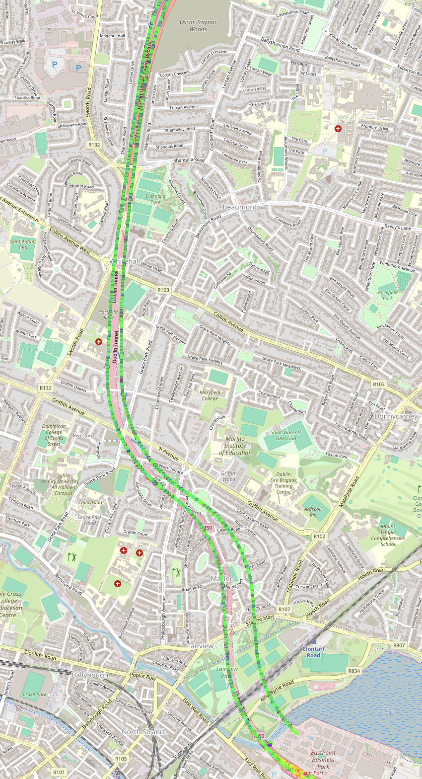
The individual vector tiles can be seen in debug here. As you zoom in you’ll see that the squares get smaller, as far as vector zoom 14. Those are the highest zoom vector tiles created and things displayed at zoom levels > 14 are actually stored in zoom 14 tiles but only displayed later.
I’m creating vector tiles with tilemaker. That creates a big “.mbtiles” file which I copy to a directory under a web server.
/var/www/html/vector/sve01: (29 GiB available)
drwxr-xr-x 2 root root       4096 Mar 14 17:31 .
drwxr-xr-x 4 root root       4096 Mar 28 01:04 ..
-rw-r--r-- 1 root root 6203834368 Apr 10 01:58 tilemaker_sve01.mbtiles
I’m using Apache as a web server and I’m using a module mod_mbtiles to allow individual vector tiles to be extracted from that and sent to a client. It would make no sense to send (in this case) 6GB of Britain and Ireland data to a client that only wants to show a map of a small part of Lincolnshire.
Why are things sometimes slow?
A large vector tile has to be extracted from the large .mbtiles file, and sent to the client. The larger this is, the longer it will take, due to network speed issues among others.
There’s also an impact on the client - it potentially has to chew through a large amount of data to get to the data that it wants to display.
I tested various scenarios - fast vs slow clients, small vs large MapLibre .json styles (based on the same Schema) and omitting data from tiles to make them just smaller. Of all of those, the most important factor was the size of the vector tiles themselves, so the challenge became “how can I minimise vector tile size at certin low zoom levels”.
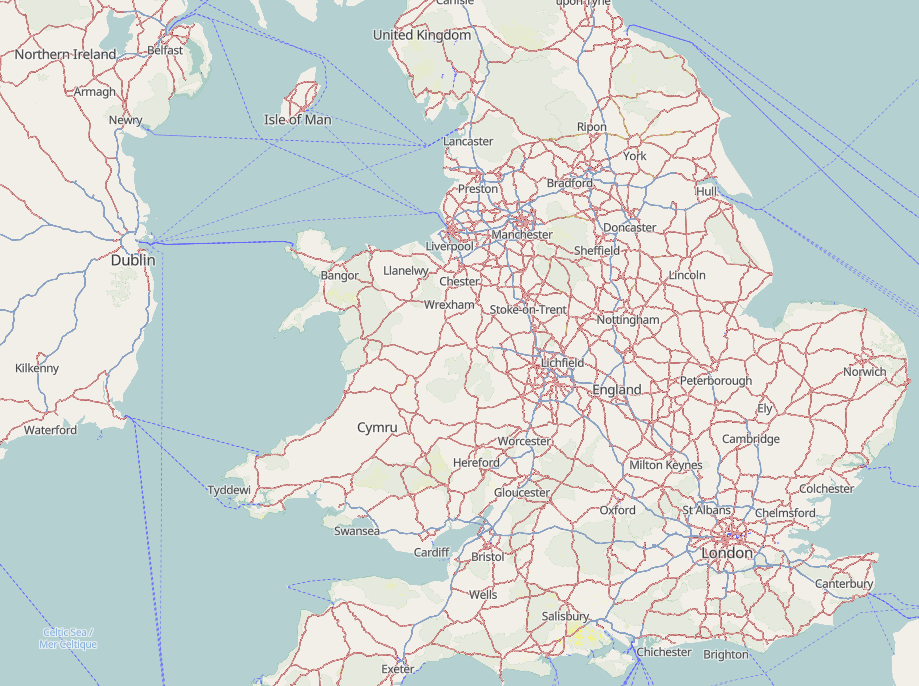
I initially looked at vector zoom 8, because it was quite slow, and was also used as a landing page zoom
Looking at Apache logs
An example entry in Apache’s access.log file looks like this:
anipaddress - - [11/Apr/2026:00:36:36 +0100] "GET /sve01/7/63/41.pbf HTTP/1.1" 200 1016621 "https://map.atownsend.org.uk/vector/index.html" "Mozilla/5.0 (X11; Linux x86_64; rv:140.0) Gecko/20100101 Firefox/140.0"
Here the path to the vector tile can be clearly seen. The “200” is the code for “yes that request was served successfully”, and the “1016621” is the size of the data returned. The browser had requested https://map.atownsend.org.uk/vector/index_svwd01.html#7/51.407/0.178 , and that zoom 7 tile contains most of southern England.
In terms of tile size, what I saw before any optimization in March 2025 was this:
zoom  a big example tile
0     19490
1     19076
2     8468
3     5442
4     69416
5     108941
6     735912
7     810916
8     1455666
9     2065707
10    1060757
11    562848
12    532770
13    343290
14    190211
The various parts of the problem
Clearly I needed to reduce the amount of data contained in a zoom 8 tile, but how? Why was it so big in the first place?
The vector style contains X because someone might want to show it.
I had originally thought of the schema as being one that could support multiple styles. There were a couple of places where I was writing things into tiles because I thought that I (or some other consumer) might want to create something to show it later. This was the same approach as I’d used for the raster tiles database - there information is stored in the database to track changes to certain objects but isn’t used for display.
In order to reduce vector tile size I removed places where I’d done this on vector.
All X is displayed at zoom Y
This was the standard approach I’d used for raster tiles (inherited from early OSM Carto versions). The cost on raster wasn’t especially noticeable, because on raster it only affected render time, and if an old tile existed that was always sent to the user first (or, if zooming in, an overzoomed lower-zoom tile). Where previous tiles existed users weren’t faced with blank space, and the CPU effort to generate a new tile was on the server, not on their device.
On vector, the architecture means that this is no longer true. A large and complicated vector tile has a direct impact on the client, and the user waiting for a map has to wait while their client creates a map from it.
A challenge is that some features may be either very large or very small. If you look here you can see that some natural parks / nature reserves are large enough to be worth showing at the zoom level (but many aren’t), and similarly some lakes are large enough the show (mainly in Ireland) but that the smaller English and Welsh lakes aren’t.
In the code, the water logic can be seen here. That then calls set_way_area_name_and_fill_minzoom_sea to decide which vector tiles to actually write details to. That in turn honours sqkm values for point features representing “large woolly areas” by using set_sqkm_name_minzoom.
If you zoom in here you’ll see initially just Irish lakes, then the largest Welsh and English ones, and eventually the smallest.
This approach allows some previously unshown large features to appear. Fir example, the large military area off Essex has been added to vector at relatively low cost (there are few of that size) but did not appear on raster.
Finding out how many of X of size Y there are
I have a rendering database for use for raster tiles for the same map style, and it can be useful for queries like this:
gis=> select osm_id,name,way_area from planet_osm_polygon where "natural" = 'water' order by way_area desc;
The top values are as expected:
   osm_id   |                              name                              |   way_area
------------+----------------------------------------------------------------+---------------
   -1121118 | Lough Neagh                                                    |   1.13296e+09
    -189915 | Lough Corrib - Loch Coirib                                     | 4.6095802e+08
     -12889 | Lough Derg                                                     |   3.21772e+08
and if we look at it the other way around:
gis=> select osm_id,name,way_area from planet_osm_polygon where "natural" = 'water' and name!='' order by way_area asc;

   osm_id   |                              name                              |   way_area
------------+----------------------------------------------------------------+---------------
 1303491300 | Porthmadog Harbour                                             |      0.010894
  304781034 | Rainwater Collection Butt                                      |       1.12869
  304780098 | Rainwater Collection Butt                                      |       1.12869
  304781037 | Rainwater Collection Butt                                      |       1.12869
  304781038 | Rainwater Collection Butt                                      |       1.12869
  304781033 | Rainwater Collection Butt                                      |       1.12869
  304781035 | Rainwater Collection Butt                                      |       1.12869
  304781036 | Rainwater Collection Butt                                      |       1.12869
  969325744 | Well                                                           |       1.62326
 1449480418 | Ditch of Bert                                                  |       1.67907
  728196775 | 130                                                            |       1.98514
For info, the first of those seems to be a bit of extreme “tagging for the renderer”. The “Rainwater Collection Butts” are “reservoirs”(!) on some allotments and “Ditch of Bert” is a school pond.
The raster database “way_area” is not the same value as Tilemaker’s vector one, but it is still useful.
Results of this optimisation
Before, the largest vector zoom 8 tile was 1455666. Afterwards, it was reduced to 729085, around 50% of the previous size. Success!
A worked example (in 2026)
In order to come up with more data for this diary entry, I wrote a simple script to analyse Apache logs and report on the largest tile at each zoom level. I then loaded only “Greater London” locally, in order to create a baseline to test against. Tile sizes were:
129951    6
281487    7
389658    8
2115753   9
1881853  10
3541994  11
1686270  12
802204   13
492326   14
Note that some low zoom tiles show much more than just the loaded area and so are artificially smaller; but the same date will be used for subsequent tests meaning that differences are relevant,
One obvious difference is the jump in size at vector zoom 11. That corresponds to where buildings are first drawn. To see if that is coincidence, let’s move buildings to vector zoom 12 as a test:
129719   6
282138   7
390274   8
2117479  9
1884428  10
880557   11
1686348  12
802561   13
492375   14
So that’s a big difference, and not a coincidence.
Next, how to look at building sizes? Let’s load Greater London into a raster database and have a look at way_area there. Here are some examples:
   osm_id   |                                         name                                         | way_area
------------+--------------------------------------------------------------------------------------+----------
   18926167 | Dagenham Engine Plant                                                                |   463567
   -1895281 | The O2                                                                               |   218893
  200652378 | Brent Cross Shopping Centre                                                          |   110867
  357278392 | Sainsbury's                                                                          |  49090.2
  227053396 | Wanis Cash and Carry                                                                 |  25921.4
   30327519 | Barking Bus Garage                                                                   |  12756.5
Using MapLibre debug it’s easy to see the vector way_area corresponding to these places - zoom in until the label is shown, and way_area is an attribute of the label in the style.
I want to include the largest buildings only in zoom 11 vector tiles, more at z12 and z13, and everything at z14. I experimented with values until I was happy with both the reduction in tile size and the visual results. The logic I ended up with was this:
if ( passedt.way_area > 5000 ) then
    MinZoom( 11 )
else
    if ( passedt.way_area > 2500 ) then
        MinZoom( 12 )
    else
        if ( passedt.way_area > 1250 ) then
            MinZoom( 13 )
        else
            MinZoom( 14 )
        end
    end
end
and the results?
129588    6
281145    7
389723    8
2115639   9
1882556  10  100%
898182   11   25%
726818   12   43%
552760   13   69%
492121   14  100%
That’s a significant reduction in tile size. Arguably zooms 11 and 12 are more usable because they’re not cluttered with lots of very small buildings
What next?
Clearly there’s more work to do, both regards to “tile size” and legibility. Zooms 9 and 10 are pretty crowded in London and the tertiary colour (which first appears there) really doesn’t work, especially over some types of landuse.


 Photos trouvées ici :


 , on LinkedIn, about a new initiative titled ‘CityMAPPER Externship 2026’, which aims to develop local capacity on mapping with OpenStreetMap and using open data, with initial focus on urban mapping in Cameroon. This initiative is a pilot project of the UN Mappers, a programme of the United Nations Global Service Centre, and has the sponsorship of the companies IVIDES DATA and TomTom, and the NGOs Humanitarian OpenStreetMap Team, GeOsm Family, and Geospatial Girls and Kids. You can
  a collection of Android apps for mobile mapping, including StreetComplete, Every Door, and MapComplete. The post provides a practical overview of their use cases and differences for efficient mapping on the go.


